
Container
概述[基础容器]
<Container /> 组件是用来划分布局的基础容器。
注意:
<Container />是一个默认会将自身宽高收缩到最小值的组件,也就是说在没有显示声明宽高,且其内部没有子组件的情况下,其宽高都为 0;在其内部具有子组件时,其宽高将会被自动撑开。
示例代码
import cooApp, { basicWidgets } from 'coolink'

const { Container, Text } = basicWidgets

export default class ColumnLayout extends cooApp.Widget {
  render () {
    return {
      <Container>
      	<Text>垂直布局文字1</Text>
      	<Text>垂直布局文字2</Text>
      	<Text>垂直布局文字3</Text>
      </Container>
    }
  }
}

export default class RowLayout extends DF.Widget {
  render () {
    return {
      <Container row>
      	<Text>水平布局文字1</Text>
      	<Text>水平布局文字2</Text>
      	<Text>水平布局文字3</Text>
      </Container>
    }
  }
}
组件属性
| 属性名 | 类型 | 说明 | 默认值 |
|---|---|---|---|
| row | boolean | 是否水平布局 垂直布局时主轴为竖轴,设为 row 后主轴为横轴 | false |
| wrap | boolean | 内容超出一行时是否允许换行 水平布局时有效 | false |
| reverse | boolean | 是否反向排列 | false |
| relative | boolean | 是否设置为相对布局 当子组件中存在 absolute 布局组件时,父组件必须设置为 relative | false |
| justifyContent | string- 'start' - 'end' - 'center' - 'spaceBetween' - 'spaceAround' | 子组件在主轴方向上的对齐方式 使用可参考:Flex 布局 | 'start' |
| alignItems | string- 'start' - 'end' - 'center' - 'stretch' - 'baseline' | 子组件在辅轴就方向上的对齐方式 使用可参考:Flex 布局 | 'start' |
| alignContent | string- 'start' - 'end' - 'center' - 'spaceBetween' - 'spaceAround' | 存在换行时,子组件多行之间的堆叠方式 使用可参考:Flex 布局 | 'start' |
样例 1
<Text
  margin={{ left: 10, top: 10, bottom: 5 }}
  padding={{ left: 10 }}
  border={{ width: 5, color: Colors.Primary, side: [ 'left' ]}}
  color={Colors.Primary}
>
  测试 Container
</Text>

<Container width={800} row padding={10}>
  <Container margin={5} flex={1} height={50}
    backgroundColor={Colors.Red} borderRadius={5} />
  <Container margin={5} flex={2} height={50}
    backgroundColor={Colors.Primary} borderRadius={5} />
  <Container margin={5} flex={3} height={50}
    backgroundColor={Colors.Primary} borderRadius={5} />
</Container>
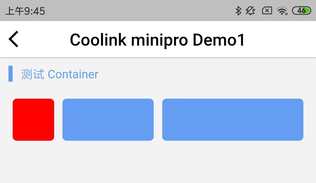
上述例子中:
row 属性表示横向弹性排列。(不指定默认为垂直弹性布局)
内层的第一个 Container 的 flex = {1} 占了总宽度的 1 份;
内层的第二个 Container 的 flex = {2} 占了总宽度的 2 份;
内层的第三个 Container 的 flex = {3} 占了总宽度的 3 份;
上述例子的效果图:
样例 2
<Text
  margin={{ left: 10, top: 10, bottom: 5 }}
  padding={{ left: 10 }}
  border={{ width: 5, color: Colors.Primary, side: [ 'left' ]}}
  color={Colors.Primary}
>
  测试 Container
</Text>

<Container width={800} row padding={10}>
  <Container margin={5} width={50} height={50}
      backgroundColor={Colors.Primary} borderRadius={5} />
  <Container margin={5} width={50} height={50}
      backgroundColor={Colors.Primary} borderRadius={5} />
  <Container margin={5} width={50} height={50}
      backgroundColor={Colors.Primary} borderRadius={5} />
</Container>
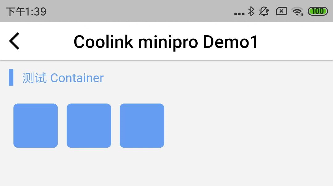
指定宽度为 50,高度为 50,圆角为 5,默认情况下对齐是向左对齐。
上述例子的效果图:
样例 3
<Text
  margin={{ left: 10, top: 10, bottom: 5 }}
  padding={{ left: 10 }}
  border={{ width: 5, color: Colors.Primary, side: [ 'left' ]}}
  color={Colors.Primary}
>
  测试 Container
</Text>

<Container width={800} row justifyContent="spaceAround" padding={10}>
  <Container margin={5} width={50} height={50}
      backgroundColor={Colors.Primary} borderRadius={5} />
  <Container margin={5} width={50} height={50}
      backgroundColor={Colors.Primary} borderRadius={5} />
  <Container margin={5} width={50} height={50}
      backgroundColor={Colors.Primary} borderRadius={5} />
</Container>
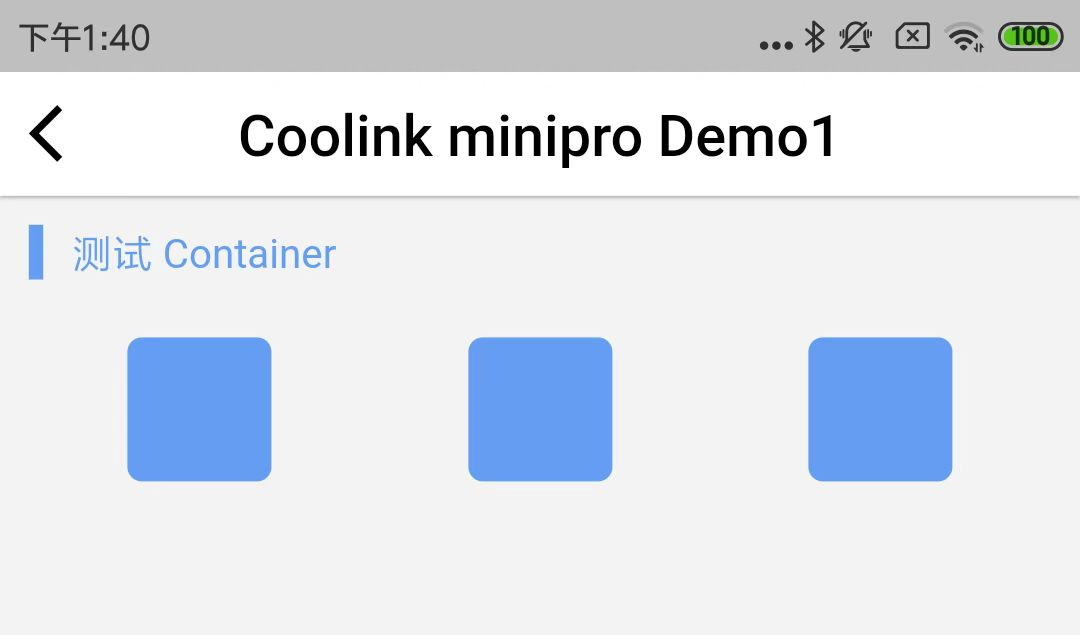
指定对齐方式为 spaceAround。
上述例子的效果图:
样例 4
<Text
  margin={{ left: 10, top: 10, bottom: 5 }}
  padding={{ left: 10 }}
  border={{ width: 5, color: Colors.Primary, side: [ 'left' ]}}
  color={Colors.Primary}
>
  测试 Container
</Text>

<Container width={800} height={300}  justifyContent="spaceBetween"
    alignItems="center" padding={10}>
  <Container margin={5} width={50} height={50}
      backgroundColor={Colors.Primary} borderRadius={5} />
  <Container margin={5} width={50} height={50}
      backgroundColor={Colors.Primary} borderRadius={5} />
  <Container margin={5} width={50} height={50}
      backgroundColor={Colors.Primary} borderRadius={5} />
</Container>
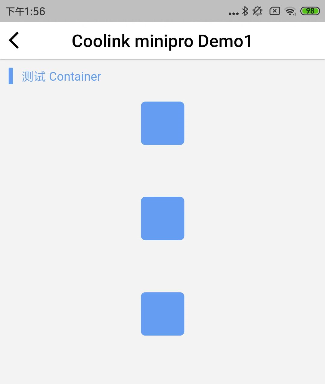
没有指定 row,则为垂直布局。外层高度指定为 300。
上述例子的效果图:
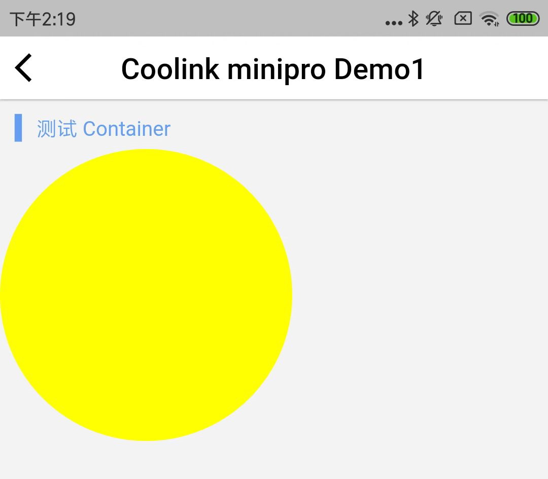
样例 5
<Text
  margin={{ left: 10, top: 10, bottom: 5 }}
  padding={{ left: 10 }}
  border={{ width: 5, color: Colors.Primary, side: [ 'left' ]}}
  color={Colors.Primary}
>
  测试 Container
</Text>

<Container width={200} height={200} backgroundColor={0xffffff00} borderRadius={100}>
</Container>
画一个圆,半径 100,颜色为黄色。
上述颜色值 0xffffff00,前面的 0xff 为不透明度,后面的 0xffff00 为 RGB 组合。
上述例子的效果图:
©深圳市酷开网络科技股份有限公司 ICP备案号粤ICP备06098778号