
AppBar
概述[导航栏]
<AppBar /> 组件是当前页面的导航栏。为了保证渲染正确,<AppBar /> 只应该在 <Page /> 组件中作为 appBar 属性使用。
注意:
AppBar 与其他基础组件的区别在于:
- 不能够脱离
<Page />单独使用;- 无法使用其他基础组件通用的属性。
- AppBar 组件会占据 Page 组件的顶部区域,内容显示区域的高度要减去这部分占据的高度,不然会超出 Page 组件的高度,界面显示异常。
- ui.appbarHeight 方法获取 AppBar 组件的高度。
示例代码
import cooApp, { basicWidgets,ui } from 'coolink'

const { Page, Container, Text, AppBar } = basicWidgets

export default class Homepage extends cooApp.Widget {
    const appbarHeight = ui.appbarHeight;
    const clientHeight = ui.screenHeight - appbarHeight;
    render () {
        return {
            <Page appBar={<AppBar title="Homepage" />}>
                <Container height={clientHeight}>
                    <Container width={200} height={200} margin={10}>
                        <Text>页面容器1</Text>
                    </Container>
                    <Container width={200} height={200} margin={10}>
                        <Text>页面容器2</Text>
                    </Container>
                        <Container width={200} height={200} margin={10}>
                        <Text>页面容器3</Text>
                    </Container>
                </Container>
            </Page>
        }
    }
}
组件属性
| 属性名 | 类型 | 说明 | 默认值 |
|---|---|---|---|
| title | string | 标题 | |
| titleColor | number | 标题色值 | 0xff000000 |
| titleSize | number | 标题字号 | 14 |
| titleWeight | string- 'normal' - 'light' - 'bold' - 'bolder' | 标题字重 | 'normal' |
| titleView | Widget | 标题视图 | |
| centerTitle | boolean | 标题是否居中 | true |
| elevation | boolean | 是否显示导航栏底边阴影 | false |
| showLeadingButton | boolean | 是否显示左侧默认返回按钮 | true |
| leading | Widget | 左侧按钮 使用该属性后将会覆盖默认的返回按钮 | |
| buttons | Widget[] | 右侧按钮组 | |
| statusTextLight | boolean | 状态栏文字颜色是否切换为亮色 | false |
| backgroundColor | number | 背景色 | 0xffffffff |
组件方法
/**
	* 通过此方法可以更快速的更新当前标题,而不用通过 setState() 触发更新
	* @param {number} title 需要显示的标题
	* 注意:当使用 titleView 时,updateTitle 方法不生效
	*/
updateTitle(title: string)
样例 1
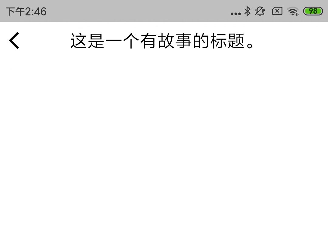
<Page appBar={<AppBar title="这是一个有故事的标题。" />}></Page>
上述例子的效果图:
©深圳市酷开网络科技股份有限公司 ICP备案号粤ICP备06098778号